Project Summary
For our project, we combined historical tornado records, radar station data, regional risk modeling, and map-based visualization to help identify high-impact areas and where addition radars may be needed.
First, we grouped the tornadoes into geographic regions then evaluated the likelihood of high-impact tornado events, this was the regional risk values. We then took these results to help generate predictions for tornado activity from 2026-2030.
Then, instead of only showing where tornadoes occur, we used the results from the model to compare high-risk regions to the existing radar station locations to see if these high-impact regions were already supported or if there was a coverage gap.
Finally, we used Vaadin to build an interactive map that let’s the user switch between two views across all the regions: Risk View and Radar Need View. This makes it easier to visualize both the level of risk and where additional radar coverage is needed for each region.
Project Development Process
To begin the project, we used Java and Tablesaw to read, filter, and group the CSV datasets. CSV files were also used to save the results from our model to later be called on in our Vaadin dashboard. The tornado dataset was used to identify high-impact events, group the tornados into different geographic regions, and then used to calculate the regional risk values based on tornado frequency and severity.
After calculating the regional values, we used these values to build the forecasting model using SMILE RandomForest. This model was used to estimate future regional tornado risk. We adjusted the model to reduce unrealistic predictions and make the results better match with expected tornado patterns. This distance was then used to identify potential coverage gaps and the radar need score.
Following the creation of this model, the radar station data was used to calculate the distance between each region and the nearest radar station. This distance was then used for the radar need score. This data was also used in the interactive map in the tornado risk view to show the current existing radar stations.
Finally, we built the Vaadin dashboard to show a visual of our results. The interactive map has two views that include both the forecasting model and the radar station data.
Key Features
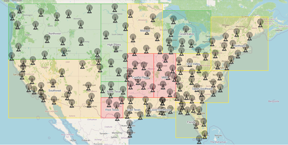
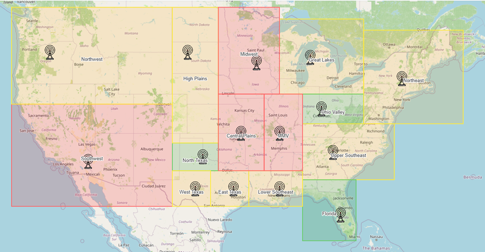
The main feature of our project is the interactive Vaadin map. The map allows the user to switch between two different views: Risk View and Radar Need View. The Risk View shows which regions have a higher tornado risk and the Radar Need View shows which regions need additional radars.
Both these views have similar but different regional colors. For the Risk View, the regions are outlined and filled with a color based on their risk score. Green represents low risk, yellow represents moderate risk, and red represents high risk. For the Radar Need View, the regions are outlined and filled with a color based on the radar need score. Green represents low radar priority, yellow represents moderate radar priority, and red represents high radar priority.
The interactive Vaadin map also shows radar locations on the map. In the Risk View, it shows the current existing radar stations. In the Radar Need View, it shows proposed radar locations based on the radar need score.
Risk View
Radar Need View
Reflection
This project helped me understand how important it is to organize data and code from the very beginning. For us that was through writing out steps on what we were going to do next, having comments, and lots of spacing between the different parts. We also divided the work and made sure we knew what the other was working on.
One of the challenges we faced was getting the forecast model to have realistic results. This was fixed by going back and adjusting how we were using the data to be more like the expected tornado patterns.
The strength of this project, I feel like, is our interactive map. I feel like having the two different views makes it easier for users to see the difference between risk and radar need. For some regions they do not need both or even one.
At the end, I felt like this was a very rewarding project. I learned how to manipulate data more, adjust forecasting models, and how to work with Vaadin maps. Overall, I feel more experienced with making coding related decisions to get the program to work the way I need it to.